VAŠI PORADCI - one brand two solutions
Vaši Poradci is an established financial advisory company based in the Czech Republic.
They approached me at the beginning of this year looking for a complete rebrand.
Over the years, they have built an impressive ecosystem of companies spanning real estate, investments and everything in between. However, their branding no longer reflected who they had become, and they felt it was beginning to limit their growth.
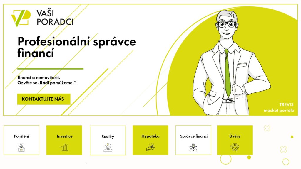
Their previous identity had a bit of a DIY feel—which, in fairness, it was. While it had served them well in the early days, the business had clearly outgrown it. The primary colour was a bright yellow that failed to communicate professionalism or expertise. Combined with generic illustrations and typography, the visual identity lacked distinction and was easily forgettable.
The old logo was problematic in several ways. The number of colours and individual elements made it feel fragmented rather than cohesive, as if unrelated components had simply been placed next to one another.
Below, you can see the original visual identity. The brief was simple: modernise and elevate the brand so it clearly reflects a company that is a leading expert in its field.
THE FIRST SOLUTION
As always, we started with a thorough Strategy Call, during which I tried to uncover as much as possible about the brand—from their target audience and ideal customer to the client journey, their exact offering and long-term vision.
Talking about the future is always a crucial part of my process – it ensures the visual identity doesn’t just reflect where the business is today, but also supports where it’s heading, remaining scalable and adaptable as the company grows.
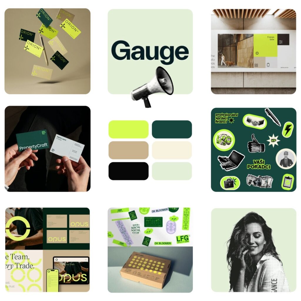
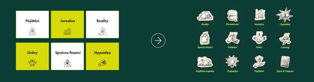
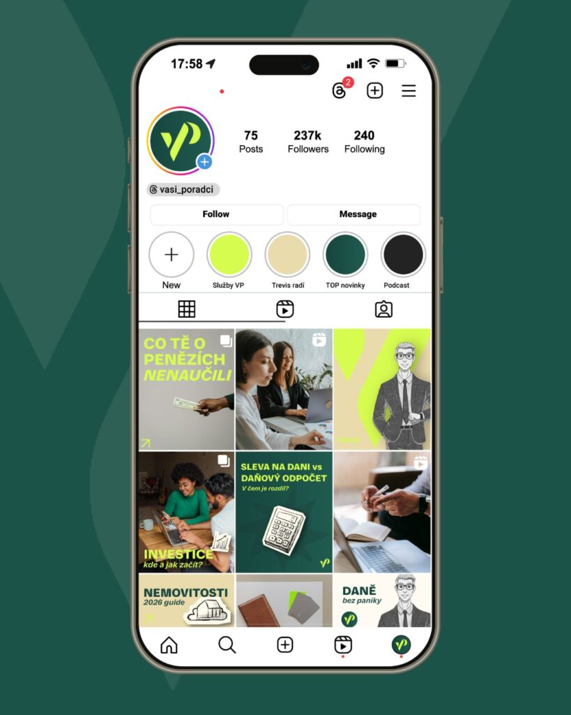
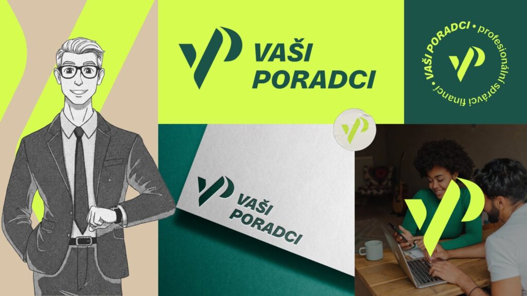
Although they knew the brand needed a significant visual refresh, there were still a few elements they wanted to preserve—most notably the comic-inspired illustrations and the bright neon yellow.
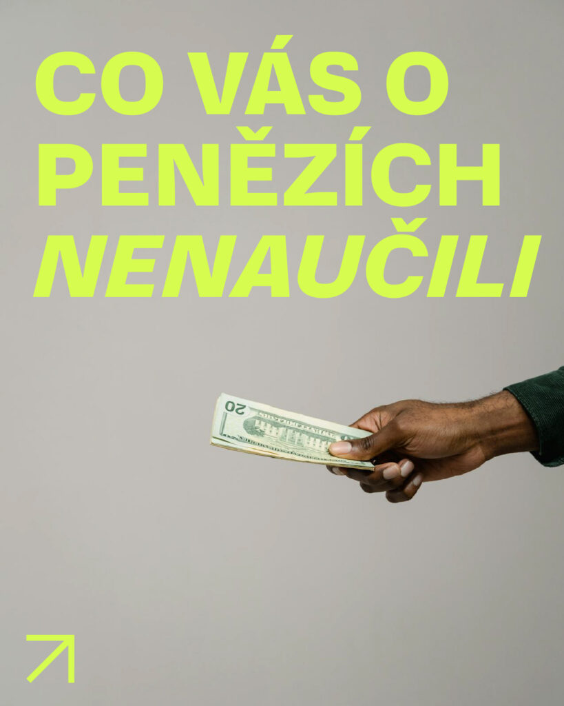
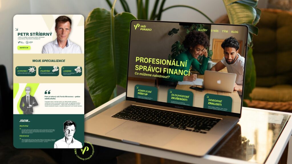
Instead of removing these completely, I decided to reinterpret them in a more refined, contemporary way. In a sea of blue, corporate financial brands, I saw this as an opportunity to create something genuinely distinctive while still feeling professional and trustworthy.
The key values they wanted the new identity to communicate were trust, stability, approachability, friendliness, creativity, innovation and differentiation. In essence, they wanted the brand to say:
“We’re experts in finance—we just do things a little differently.”
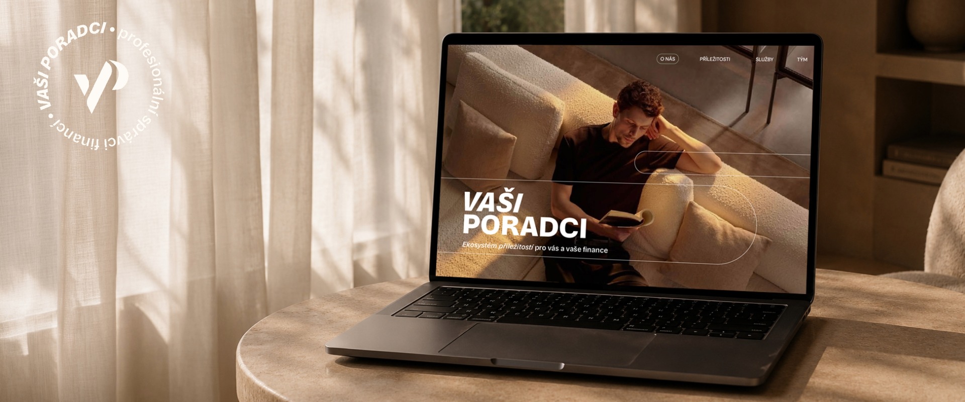
The logo was redesigned to better reflect the personality, values and ambitions of the Vaši Poradci brand. The monogram embraces a contemporary aesthetic, combining minimalism with subtle symbolism. A slight italic slant introduces a sense of movement and progress, representing innovation, forward thinking and a modern approach.
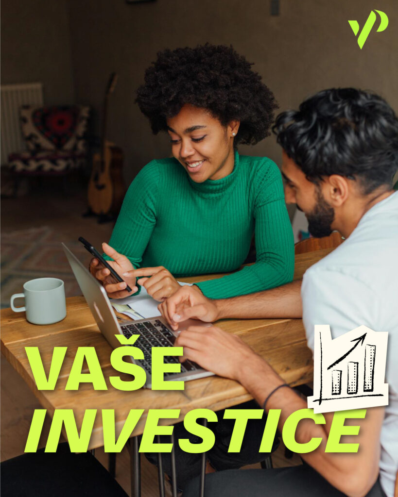
THE APPROVED CREATIVE DIRECTION
THE SECOND SOLUTION
Throughout the project, something unexpected happened—something most designers wouldn’t be thrilled about.
Although the client loved the concept I presented, they realised that remaining “just” a financial advisory company was no longer the direction they wanted to pursue.
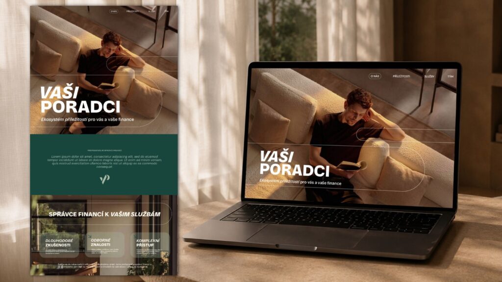
Following a series of internal changes, they shifted their vision entirely. Instead of positioning themselves as financial advisors with a few side ventures, they decided to build something much bigger: an investment ecosystem that brings together a diverse portfolio of businesses under one umbrella brand. Their goal became creating an ecosystem of opportunities, offering clients services across three key pillars: finance, lifestyle and real estate.
Naturally, this meant a significant shift in the original brief. The target audience changed from a broad range of clients to high-net-worth individuals looking to invest and build long-term wealth. As a result, the brand no longer needed to feel playful or overtly approachable—it needed to communicate expertise, credibility and a premium level of service.
This led to a completely new creative direction.
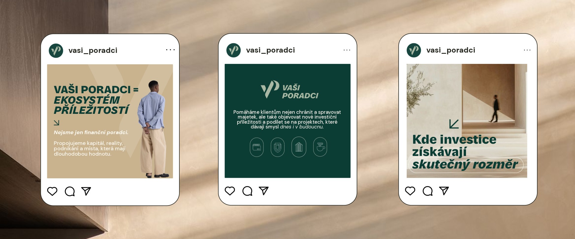
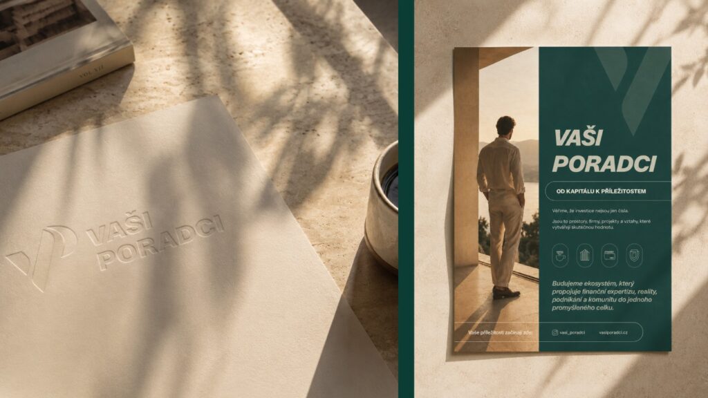
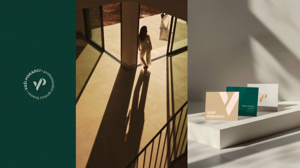
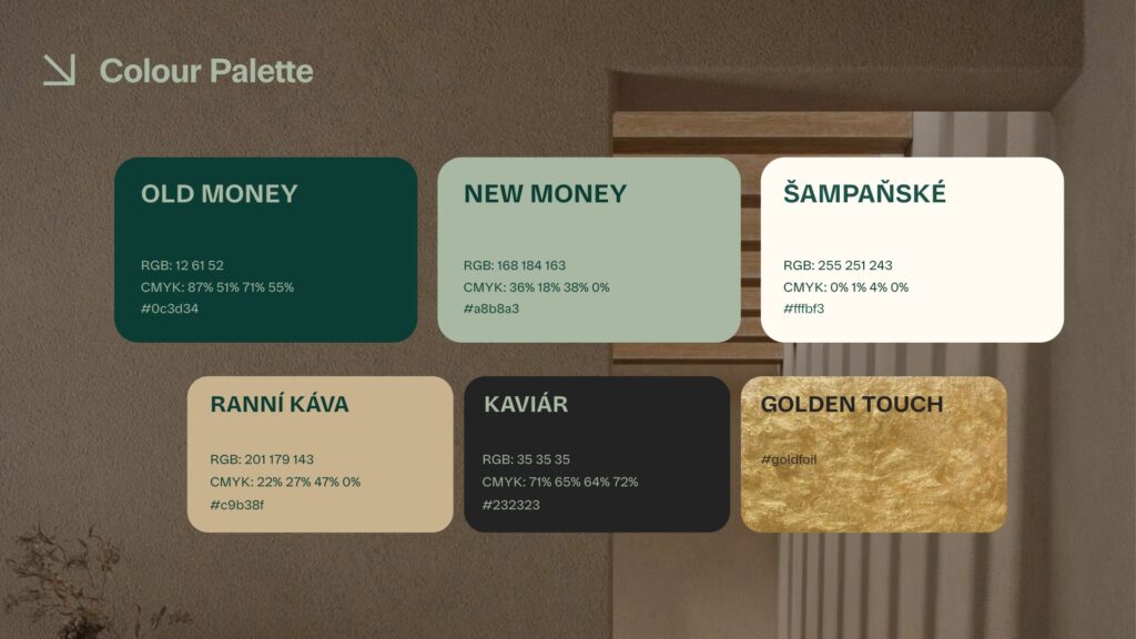
I based the visual identity around the idea of quiet luxury, moving away from the original concept, which relied on friendliness, playful illustrations and transparency of the company’s inner workings. Instead, I focused on the transformation clients experience when working with Vaši Poradci: more time, more freedom and greater peace of mind.
The goal wasn’t to communicate wealth through expensive cars, designer watches or extravagant architecture. It was to capture the feeling that comes after financial success—the calm, the space to focus on what truly matters and the lifestyle that financial freedom makes possible.
klara lachman
Let’s work together! Drop me a line and I’ll get back to you shortly. Looking forward to hearing from you!
QUICK LINKS
GET IN TOUCH
- Email: design@klaralachman.com
- Phone: +420724433889