Som Num is one of my favourite conceptual projects to date. I took on this visual identity because I wanted something exciting to sharpen my skills on — and this one delivered.
The brief was for an up-and-coming tech company selling Bluetooth-enabled mattresses that help users track their sleep. The goal was to create a simple yet memorable visual identity that clearly communicates the brand’s purpose. The key words? Modern, tech, minimalistic.
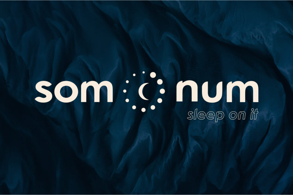
I aimed to stick closely to the brief while adding a playful twist that would help the brand stand out from potential competitors. The logo suite reflects this — with rounded letterforms in som num that subtly reference the soft, cozy texture of a mattress. The logo mark features twelve dots, a nod to both the ticking of clocks (symbolising sleep tracking) and the technical side of the product.
The colour palette was chosen with care:
A deep navy blue evokes calm, night-time comfort, while also aligning with the trust and stability commonly associated with tech brands.
A warm accent beige brings balance and a touch of softness, creating a harmonious, approachable aesthetic.
som-num [Recovered]
klara lachman
Let’s work together! Drop me a line and I’ll get back to you shortly. Looking forward to hearing from you!